(S)CSS Editor


Check out the large size!
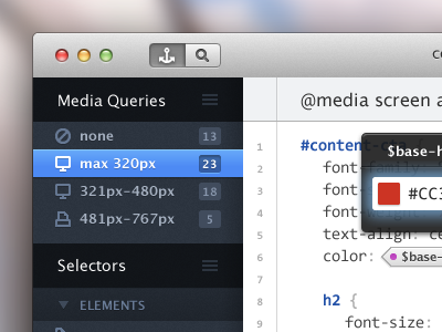
Responsive SCSS is essentially tabular data – you have selectors (tags, classes and IDs) on one axis and media queries on another. At the present, we must either list selectors as children of media queries or vice versa.
Pick the first approach and the styles for one selector are scattered far and wide across the stylesheet(s) – it's difficult to quickly evaluate the style differences for a particular selector across multiple breakpoints.
Choose the second approach and you're nesting 3-4 media queries inside every rule.
This app proposes a solution – what if you could dynamically sort and display your SCSS rules according to either media query or selector? The raw file would still be structured with media queries as parents and selectors as children, but if you opened your SCSS file in this app, you'd also be able to quickly view all instances of x selector within your stylesheet, no matter which media query/queries it resided within.
As an added bonus, if you're using SASS or SCSS, why not be able to edit global variables directly from the file you're working on?


