


Grad House variations

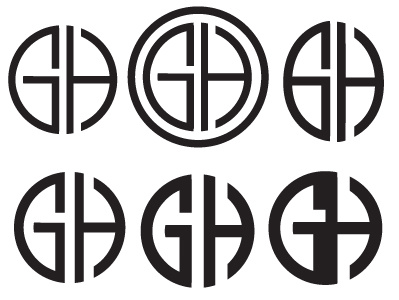
More Grad House logo work. Top right is a copy of any old logo of theirs. I find it too oblong. Bottom right is obviously too abstracted.
More Grad House logo work. Top right is a copy of any old logo of theirs. I find it too oblong. Bottom right is obviously too abstracted.


