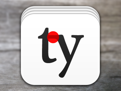
Simplified Icon

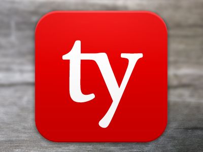
I started building a favicon based on the last shot and realized it was way too complex. So instead I simplified the icon even more, ensuring it looks just as good at 300px as it does at 16px. Thoughts and feelings on the new direction?
Be sure to check out the typecards app preview too