The Vanity Cover Sketches

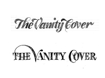
Here are two of the sketches I drew for a friend's blog. She wanted something with style, but not really haute-couture. I thought she would definitely go for the first one. To my surprise she opted for the sketch on the bottom. When I asked her why, she swiftly replied that the top one looks too girlish and she liked the bit of authority the second one suggests.
You can see the finished logotype here: http://drbl.in/dyow


