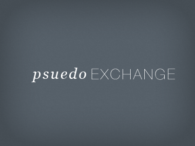
Psuedo Exchange
Just messing around with different typography. I was looking for something a litter thinner on the left, but in my opinion, I feel like Times New Roman is a little overlooked. When it is italicized and kerning-adjustments are made, forget about it, I think it is classy as shit. To balance the thickness of Times New Roman, I went with something a little more plain but elegant to a degree (much as times is or can be), so without much hesitation, I discovered Helvitica Neue to dance well with Times.
More by Jacob Kelley View profile
Like


