'Refined' rebounded

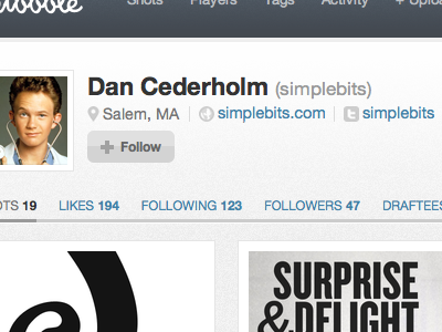
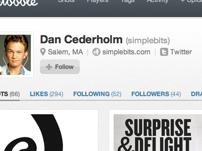
I love your idea Dan, but I think by removing the brackets around the meta numbers and reducing the opacity and size of the three icons, it helps to remove a little visual noise. The meta numbers are more important to me than their labels (I know the labels will always stay constant), so I've tried switching their respective weights.
Seeing as the Twitter icon already signifies a link to your Twitter account, I tried simply including your username as the link text. I actually prefer the website and Twitter links in the #777 grey from your previous rebound, but I've tried colouring them in the standard link blue for the sake of continuity. Anyway, my two pence. Look forward to seeing this stuff go live!