


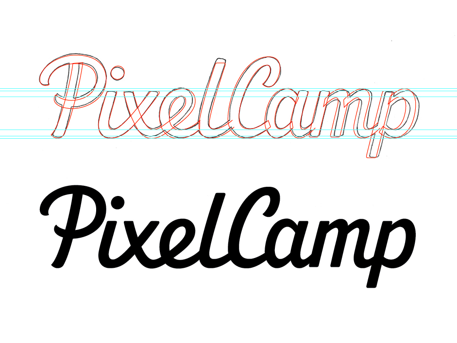
PixelCamp - Vector

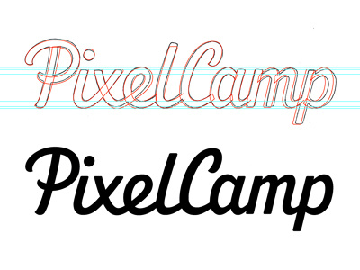
First vector draft after drawing over the final sketch. Still not too sure about the 'm', it just feels quite tall because of the large x-height I've used to help legibility at smaller sizes. It also feels a little darker generally, so I've compensated by making its verticals thinner (not sure if it's enough though?) I also struggled with the angle of the 'e' because of its connection to the 'x', which doesn't give the counter much flexibility. Any feedback is much appreciated!
Also tried an alternate version with a little brush style 'flick' on the top right bar of 'x' and the descender of 'p' but while it did add some nice continuity, it added a little too much flourish.


