53 Degrees

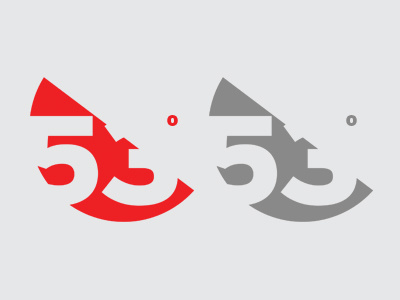
Feeling much happier around this mark now, I feel that a flat, solid colour approach is much more in the direction that I want this to be and I think by removing the typographic element to the right, really simplifies and makes the mark stronger? (colour and greyscale reverse shown)