


New College Durham - Rebrand Project

For a PPD module that I am currently working on our task was to rebrand our college with a new identity that will be chosen by the board of directors and distributed throughout the college campus and within the community.
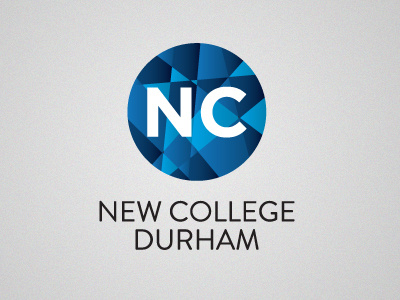
The ideas behind this design was to keep it extremely simple and eye-catching.
- The circle shape is used to represent wholeness throughout the college
- The segments within the circle are used to show the different types of people that the college caters for e.g. school leavers, 6th form, higher education and adult learners.
Any feedback or ideas how I can take this design further would be very much appreciated.
Many Thanks
Jonathan


