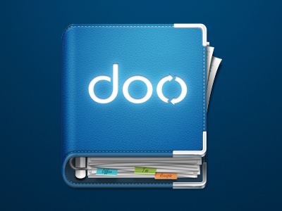
doo App Icon
Icon for the upcoming doo application, which will be the iTunes for papers and documents.
This is the 9th major version of the icon and we're really happy with it. Except the texture and the chrome ring, everything was made with Photoshop. The ring binder metaphor works really well and is recognizable in very small sizes. Check out the full version for all details :)
Thanks to Kajdax for working with us on the different versions and thanks to Sebastian from 6wunderkinder for drafting me ;)
More by Michael Stache View profile
Like


