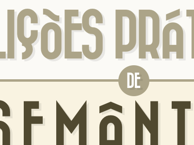
Dropped draft of the cover of a presentation
Really enjoy the erratic alignment from the accented chars and the Ç, but this typeface is miles away from the feeling I want to transmit.
It was lots of fun laying it out, though. I'm switching to good old gotham.
View all tags
Posted on
Nov 2, 2011
More by André Luís View profile
Like


