Personal logo work

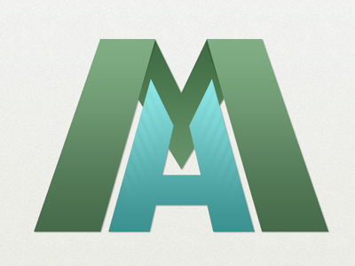
Current progress of the personal logo. Reworked the H a little bit as it appeared more like an A in the previous versions. Also felt like the green represents me much better than the other color schemes I was toying with. As always, critiques welcomed