


Making Internal Charts Fun

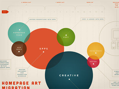
I wanted to design a fun way to show our new process for migrating some artwork for the first part of this year.
The circles represent the amount of days spent in each phase, and highlight which team is involved. It's fun to see where the overlaps are in the process, and which items can be executed with a more agile approach.


