


Oh yellow o

The Google logo is classic and iconic. I worked with another designer last year to give it a refresh. I could probably write a blog post or two about it - maybe someday. Did you know each size of the logo is hand-crafted to get the pixels just right?
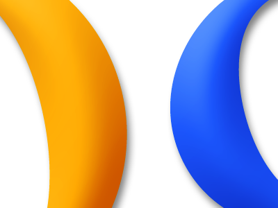
I'm thinking about it again today. In particular, the yellow 'o'. Yellow on white is such a pain. We orange-ified it last year to cope with a smoothing of the bevel and reduction in the drop shadow, otherwise the 'o' gets lost and you end up with what we call the "Go gluh" problem ("Go gle").
You have to balance each letter with the letters around it. I often return to the logo because it's such a beautiful problem - balancing so much: color, form, light source, weight, heft, font, typography, brand, etc. It is a microcosm of big, meaty design challenges.


