


Aliasing Lessons Learned

My notes (yes, sometimes I take 8-bit notes in Photoshop) from hand skewing and aliasing type for The Last Rocket logo.
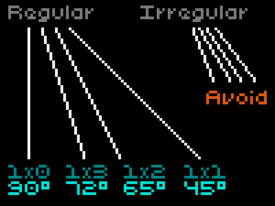
While less distracting here in shorter strokes, using irregular patterns to draw angled edges or lines can create distracting stepping patterns. Unfortunately, depending on the letterform, they're not entirely avoidable (there's still some irregular angles in the A, K and on the bars of the E in The Last Rocket logo but those that remain are the lesser of all the irregular evils I tried).
The trick I found was to fudge the letter shapes to the nearest regular angle then tightly kern to hide the perspective discrepancies that creates.
This all comes from studying the NES Mega Man logo. 8-bit pixel-pushers: any other tricks to share?


