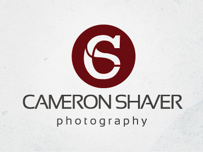
Cameron Shaver Logo Refresh - Alternate
Here's another shot for the Cameron Shaver logo refresh (see my first shot for details). This one takes it in a markedly different direction.
I tried to work with the similar shapes of both letters to superimpose them over top of each other. It's kind of a cool effect, but after working on it for a while I've started to see a really weird looking 6...
Thoughts? I think I prefer the other version better.
View all tags
Posted on
Sep 23, 2011
More by Matt Ward View profile
Like


