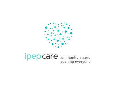
iPEP-C.a.r.e. HIV Prevention Logo
This is a turning into quite a passionate project for me the more I immerse myself into everything HIV. This is the first concept that has yet to be presented to the client.
iPEP-C.A.R.E. is a pilot public health intervention that will begin next year in New York City with the goal of decreasing HIV especially in minority communities. iPEP-CARE is the name and the "CARE" acronym stands for "community access reaching everyone".
PEP stands for "post-exposure prophylaxis" which is an antiretroviral drug treatment
that is started immediately after someone is exposed to HIV.
It's not a competitive intervention, but is government funded and they would like to try and stand out from the myriad of health and HIV type branding that currently exists.
The logo needs to attract public health minded physicians and pharmacists who will be participating in this trial/pilot study, and who will be prescribing the medication; the project is also funded by NIH so it should appeal to government funders who will be watching this trial closely; it should also appeal to potential minority-targeted participants in the study and have a soft and welcoming feel to it without being overly happy happy happy and full of insincere promises.
So the key phrases:
That this is an innovative campaign that is based in the community and that it will connect people that might be exposed to HIV to an innovative treatment; and…
the identity should express care, community, and public health.
It's a challenge for sure as so many logos are less than inspiring and yet here I am using a heart of all things.
Trust me when I say I have been torn between using the most overused shape in medical and health logos but I hope I have been able to visualise it in such a way as to be not so in your face but a visual reminder that everything starts with the heart from pumping of the blood to the more emotional side {I know that's the head but you know what I mean}
I wanted to instill a sense of cleanliness and freshness that would fit in with the more pharmaceutical side of the intervention whilst not being too sterile or generic as to alienate the very people that need the help and support from the study and the health care professionals. It needs to speak to two very different audiences without, or reducing possible alienation.
The typography is based on Ultima which is a nice clean, stylish yet soft and rounded face that add's the care and approachable idea behind this study. I have several colour versions of this with the orange shade being a 2nd favourite of mine.
The heart therefore consists of varying size circles that represent the community as a whole, some closer and some further afield, some easier to reach or convince than others, but everyone within a defined area.
The circles also represent things at the molecule and biological level and is a nod to all the important lab work that goes on to make these treatments available.
There is a good chance that the logo will be animated so my idea is that this could be created in a 3D format where the smaller circles represent the furthest away on this contoured heart, and that the circles could pulsate (heart beating or indicating life/movement] or even move in a very subtle way or the heart just rotates in a true 360 format. Even the ability to select a circle which zooms in to show a member of the health care of even a supposed member of the public that puts a more human and personable angle on this for more diverse marketing needs.
Simply the logo has to tip-toe a balance between the needs and requirements of the medical profession, the government and the very susceptible people this is aimed at within New York.


