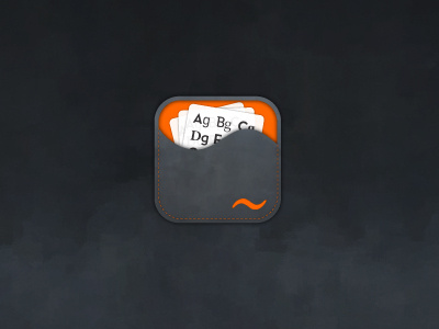
Fontfuse Mobile App Logo
New project for Extensis the long standing font management guys. They are creating mobile app's of their FontFuse and WebINK web services so have hired me to design the app icons.
http://fontfuse.webink.com/
http://www.extensis.com/en/WebINK/
The first one is for FontFuse which is a site mostly aimed at helping designers match and combine font pairings. There are existing logos for FontFuse and WebINK so I am tasked with creating something based on this existing identity.
After looking at the Android Specifications for icons I realised that I now much prefer their perspective on app design than Apple's. Never been a fan of gloss and big f**k-off corners so the Android sensibility of subtle, flat and tactile looking icons scores highly for me.
So given the desire to avoid gloss and shine I have decided to focus the overall look and feel of the iOS icons based on the official Android icon design specification—now tempted to get an Android.
This is the first idea presented to Extensis for FontFuse and I have tried to find a balance between subtle texture (found via Google after a lengthy search for something half decent that wasn't metal or wood) and visual connections to what FontFuse is about. The direction has taken me down the path of a form of tactile case/wallet/folder/sleeve made of nubuck/suede that holds seperate sheets of font pairing examples.
The orange wiggle, electronic symbol for a fuse, is a refinement of the existing wiggle that I took upon myself to improve to use as a identifying mark. It's also more like a tilde now so that is a closer link to typography than the fuse. I have also created the sleeve opening from this wiggle and using orange to highlight the interior but to also set off the white card sheets.
As Android allows for inconsistent edges it is possible that this version will have the card slips poking out of the top as well as sharper corners.


