


Project 365 Infographics

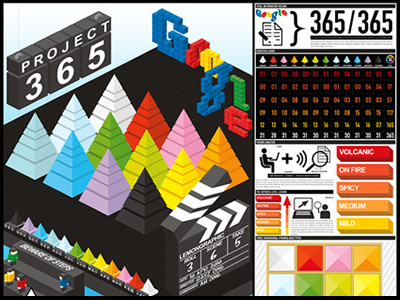


This is a Introduction poster for my Project 365 Graphical degree Project 2010. Each pyramids represents the amount of data collected for each month and the colors is categorized in 12 different months. A statistics charts is accompany by the poster to create an overview of information of the design. Full details at : http://bit.ly/kOvOF1


