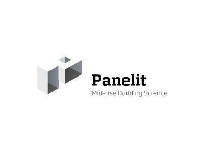
Building/Construction Logo

Close to final design. We have altered the colour sequence in the graphic: putting the visual focus on the walls rather than the floor. The original colour pattern seemed to distract from the 3-D aspect a little, created the wrong focus point.
As I have shrunk the logo-mark down for this revision, I ended up creating medium weight of the Panelit font, as the bold was too bold and regular was too light.
This is the key-line version.
For printing purposes: letterheads, business card and other forms of marketing etc, the roof will be white and then embossed or a Spot-UV applied thus lifting a portion of the building up from the paper. For web use, a 2-3% tint will be applied as the image shows.