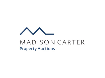
Property Auctions Logo
One of a few ideas being floated for a UK Property Auctioneers who focus on residential and small business properties.
Part of the brief is that that they ideally wanted some form of initial-mark within the logo, other than that no particular requirements.
First thing was to play with the m shape, it's a pretty common initial in logo designs and is nice to use due to it's balanced shape. But trying to find something relatively unique is not so easy nowadays.
When you get a certain range of letters that can somehow be worked to visually represent the business, you can count yourself quite fortunate. In this case the m makes an excellent visual of house roof tops. It's not a unique idea, but I was hoping to be able to style it in such a way that it works without looking cliché
Whilst playing with the rooftops and looking at the brief I sort of realised that a possible 'key' could be loosely worked in. It's not meant to be obvious, but I hope that some people may make the association. I think it's more about inferring rather than stating.
So with some brutally simple shaping and positioning, we end up with a very line drawing that presents the M, a couple of roof-tops and a very subtle end of a door key. I think it could prove to be a useful subconscious direction to a property buyer... It's open, it's spacious its inviting you to open up and take a look.
All relatively subtle in their own way, but creates the sense that if you work with Madison you will be getting the keys to your own property very soon.


