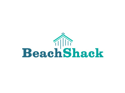
The Beach Shack Logo
New concept for a home spun clothing and beach fashion company. Home based, they create distinct patterned cushions–the general style is based around coloured stripes–such as: pillows, blankets and casual beach wear.
It's a pretty low key affair, so they are looking for something quite down to earth but that still retains a clean classic style.
I used Clarendon Bold for this font–the first time I think I have used it for a logo–which I feel works really well for this UK home based business.
The idea was not to be too literall, but after a while I saw an idea that did use a Beach Shack but does so in a more neutral manor.
The importance here is what the visual of the Beach Shack represents. The hut not just a graphic of any beach hut, it signifies that this hut IS the Beach Shack, it is where everything originated–it didn't of course, I am weaving in a small background story with the company. So I am programming in a little made-up history, one that creates a nice overall feeling.
The positioning and placement of the icon is also relevant here; I am integrating both word and graphic to form this cohesive logo.
Did they at any time make stuff in a Beach Shack, or do they still have a beach shack where they sell stuff from? The idea is to just create a sense of curiosity rather than just relying on a literall graphic because it's relevant.


