Tom & Teddy Vintage Beachwear Brand

New project for a fashion brand targeting fathers and sons with matching casual, beach, swim and surf wear.
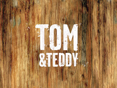
The objective was to create a strong but clean type orientated brand mark, something that instilled a sense of classy vintage style. One that would be straight forward to print onto clothing and various materials and that would also create a visual image of the differences between father and son, namely the physical size but also suggesting the protective nature of the father. A wordmark that would work well in mono as well as 2 colours, stamped onto a metal badge, branded onto a leather patch, stitched onto a shirt or just embossed onto a rubber badge.
Focusing then on these aspects, using a condensed font allowed for some snug fitting typography, killing two birds with one stone. Tom is clearly dominant, but is also out front, taking the lead and has a careful arm around his son.
A fashion conscious father and mother should be encouraged to check out the Tom & Teddy brand without feeling it looks cheesy or tacky. Possibly the mother would buy both father and son matching shorts as a gift or the father would just feel proud to buy himself and his son something cool and jazzy.
That the actual brand mark when printed onto shirts and shorts should look cool as well as stylish.
The actual logo can be aged when required, maybe painted onto wooden signs and walls, yet when used as a clothing label, the logo could be clean and new looking. The idea is that we can create a new and old feeling of the brand, depending on the environment and materials, to help create a sense of past and history.


