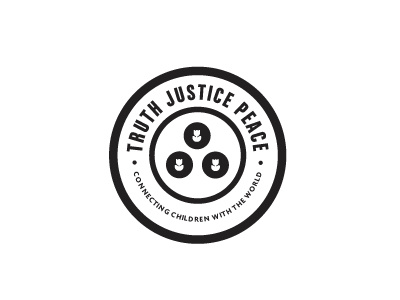
TJP Logo Design

Revised after client comments. There was no real brief with this job, certainly no ideas on design direction, what I should or should not include. So it's been an interesting direction to take.
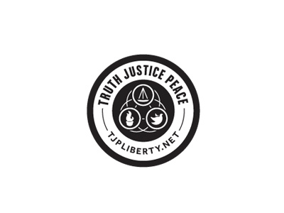
We now have three icons representing the 3 core meanings : Truth=Greek Torch, Justice=Scales and Peace=Dove.
The icons were tricky as with Justice and Truth, there is not a single common representative symbol.
So some research later, turns out the most common symbol for Truth is the Greek Torch. Justice came down to finding the best fitting symbol, so I chose one half of the scales, a pair would be been to small. Peace was the easier one, but a little bit of a cliché. But in the end, a familiar symbol won out.
Sometimes you have to go with the most obvious.
Each icon tweaked so that the outer boundaries followed, where possible the inner curves of the circle, the dove being the better example. Still some tweaks required to the icons, but pretty much there.
The client pretty much insisted on having a 'Unity - 3 overlapping circles' symbol incorporated, but I was initially quite hesitant. But with some tinkering, I was able to include it within the background and it actually works well. It helps 'unite' the 3 symbols together rather than having a black solid void surrounding them.
Old tag line has been simply replaced with the web address.
Now to work on colours.