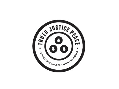
'Truth. Justice. Peace.' Logo and Rebrand
A rebrand of an existing 'not for profit' organisation called 'Truth, Justice, Peace.'
'Liberating people from suffering around the world.' Although the focus is on children, it encompasses adults as well.
First draft of main idea which client has actually approved. So now its refining details, type, icons etc.
The 3 inner icons are only placeholders for now as I am developing 3 unique icons to symbolise their 3 core elements : 1) Unity of purpose 2) Truth Dissemination 3) Direct Action
The 3 icons are arranged so as to create a connected loop within/part of the world' which is represented by the inner circle.
A self enclosed logo, for the most part, is far more flexible when it comes to marketing and brand placement. It's able to sit over most graphics without any real need to worry about 'fitting in'.


