


Alt. Delicious logos

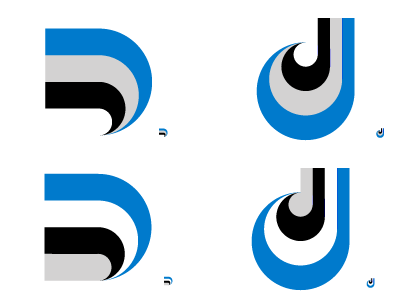
I think it's safe to say that the demise of Delicious as a piece of intellectual property can be directly attributed to its over-simplified logo. Just four squares, with the most dull of colors.
The current logo does have its advantages. It has to hold up at tiny tiny sizes like the Add This toolbar and for favicons.
Here's a couple ideas I was thinking about on the Metro this morning. Uses the same colors. I thought the upper case "D" was a good solution as it scales down nicely to maybe 8x8. but "delicious" is branded all lowercase. So I tried out lowercase shape


