


Strongspace Shield Tweak

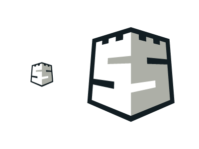
Trying out slightly thinner counters for the "S"s after feedback from the client. I like the "beefier" look this gives to the whole mark, but want to make sure it's still legible at smaller sizes. Thoughts?

Trying out slightly thinner counters for the "S"s after feedback from the client. I like the "beefier" look this gives to the whole mark, but want to make sure it's still legible at smaller sizes. Thoughts?


