Friction Factory Logo

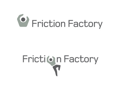
Been all over the place with this one. Looked at so many variations and you know what, reverting back to one of the first mock-up's I did. After seeing the different ideas, my instinct is that this style say's it all.
Need to stress this is for an indoor climbing center, not outside in the raw elements on real rocks. The design of the logo takes this into account thru the general style. It will appear a little more 'clean' than if it were exterior climbing.
As I mentioned earlier, this logo needs to be seen/viewed/imagined in context of a climber looking for somewhere to climb and not a garage selling wrenches.
It's not too realistic, it's not too obvious, it has a person climbing/pulling themselves up, it has the side profile of a hand feeding a rope, it has the subtle reference to strength/grip/wrench through the slight angular shape of the torso.
The type is new and I feel much more intune with the whole thing. I have pivoted the hips suggesting free air motion and swinging which gives that feeling of the 'freedom of climbing'.
The top half can be split and used as small independent icon for the website as well as being split into numerous highlight colours.
It's not totally there, but this is the idea I am suggestion to the client we focus on perfecting.