LIGHTFORCE : 2

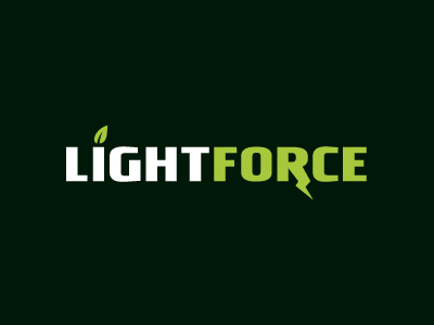
Follow up on that initial logotype study for a nutrition company. Client suggested something a little more obviously thematic, and more pronounced...
We're talking about a company who's products are made up primarily from (herbs, vegetables, wild grasses, etc.) > i.e. Greens.